WORDMARK
Wordmark: Iterations
STYLE GUIDE
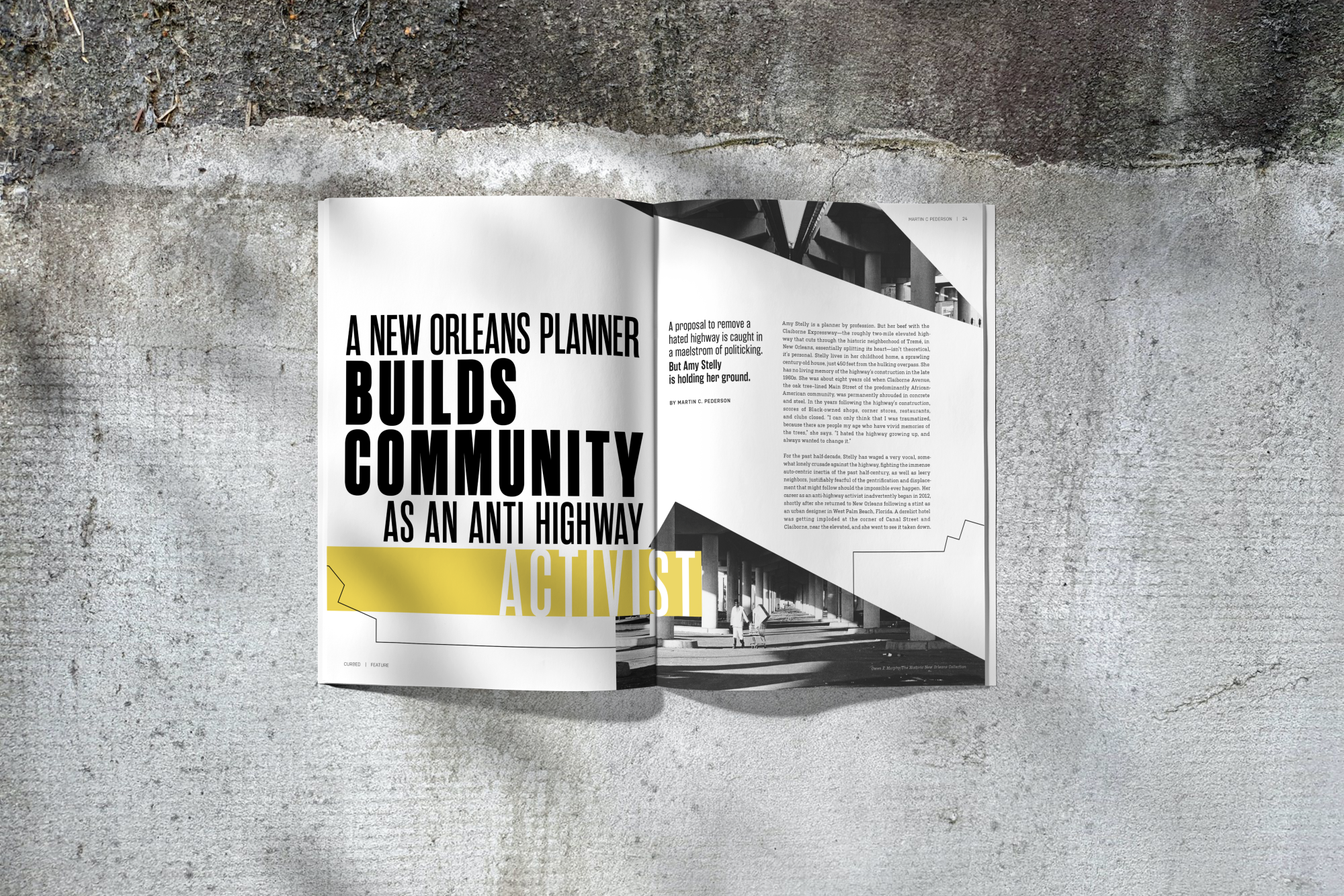
The visual system built on the themes set in place by the wordmark. I wanted to reference the hostile environments created in U.S. Cities.
typography was meant to be stark and orderly, creating large blocks that traverse the pages. Titles and call-outs follow the style of the wordmark, and appear as cutouts from bands of color.
Imagery in Curbed would be treated with abstract geometric forms and black and white photography. Lines, reminiscent of city maps, would connect images and ideas, and respond to the lines found in the imagery.
SPREADS
Another inspiration was the image of the sky peeking from behind skyscrapers, and the stark contrasts of light and dark forms.